| Shortcut to this page: http://faq.uporium.com/faq_question.asp?key=1287&topic=why-do-my-home-page-images-crop-on-certain-devices |
| Why do my home page images crop on certain devices? | |
ScenarioYou take a look at your website on your mobile or computer, and all the images on your home page are displaying as expected, but when viewing on a different device, or when zooming in/out there is some slight cropping on some of the images. Example -: 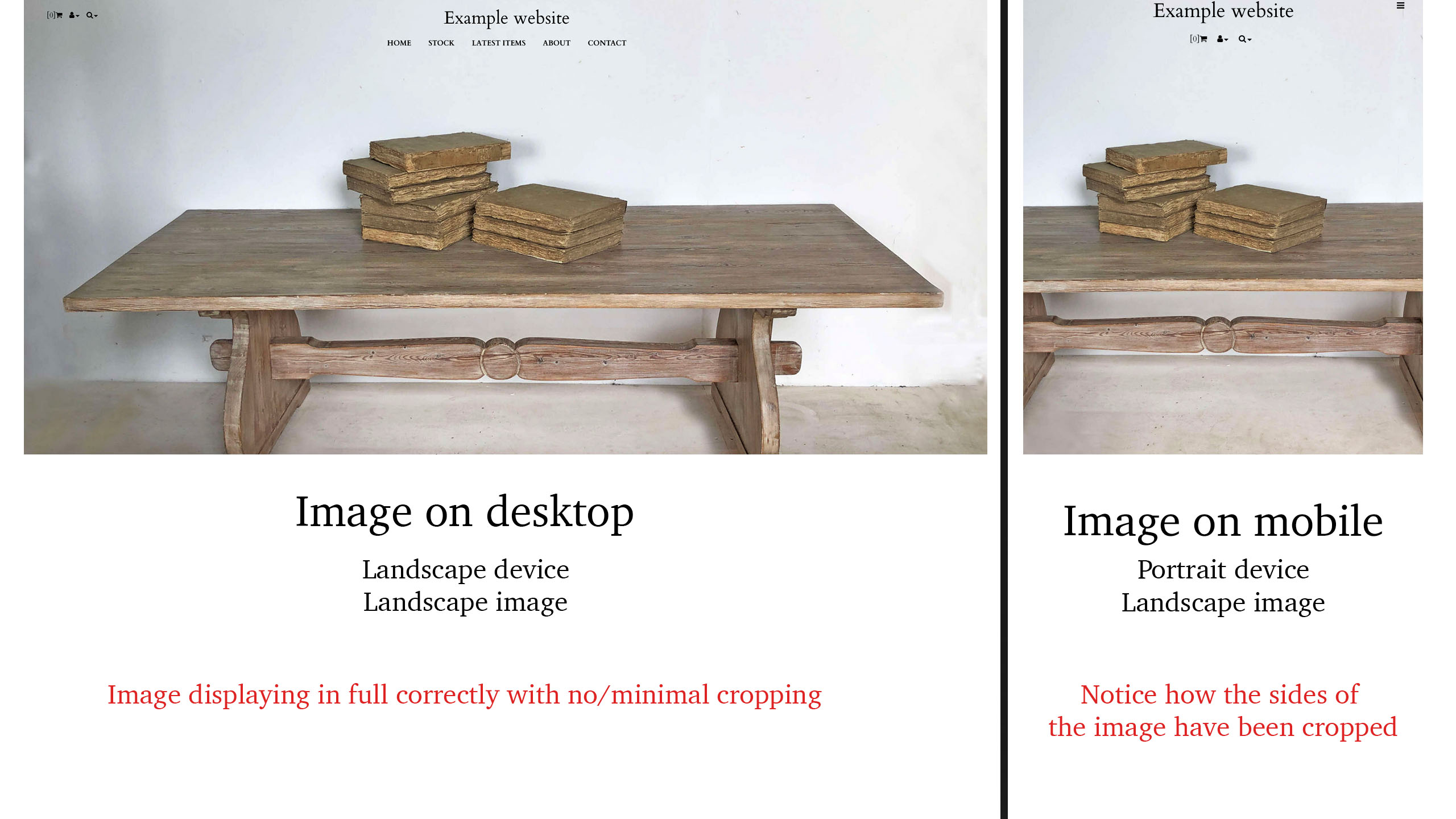 Why does this happen?When an image is displayed on your website, there are 3 ways in which the image can be used. These are -:
But what happens for example if we are trying to use a landscape image (width bigger than height), on a portrait device (height bigger than width)? In this scenario, to ensure that the image quality is not effected, your website will cut off parts of the image to make it dispaly without stretching the image, as seen in the example above. This is often a scenario of 'Responsive design' and is nothing to do internally with how your website works, but rather how EVERY website works these days. Although we would love for your images to display perfectly on every device possible, as there are a multitude of different device resolutions, unless you have a picture for each device resolution it's just not possible. What is 'Responsive design'?In this day and age, having a website that looks great on both mobile and desktop is essential to the success of your online business. As such, we implement what is known as 'Responsive design' on your website, which allows your website to display correctly on both mobile and desktop. Historically, companies would have 2 websites, one for mobile and one for desktop. However, this would also mean that the pricing of their sites would double. To solve this issue, as technology evolved, 'Responsive design' was developed to have 1 website that would just work on all devices. But this comes with some compromises like the cropping issues we are having here. A small price to pay in order to nearly half the cost of your website though. What can I do about it?Ultimately, there's no way to stop the image being cropped, but there are a couple of things that you can do the help with this issue, such as -:
|
Shortcut to this page: http://faq.uporium.com/faq_question.asp?key=1287&topic=why-do-my-home-page-images-crop-on-certain-devices
© 2025 ph9 Ltd. Any FAQ, guides, advice or acticles here is provided "as is" with no warranty and as per our terms and conditions at www.ph9.com/terms